The WGI Design System Components
Components consist of elements and features that form a single artifact within the system. They are the building blocks used to create scalable, responsive experiences within WGI Application. The design system library is an always-growing selection of components that each contain one or more kinds to fit multiple scenarios.
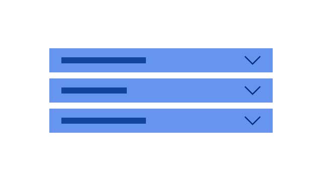
Accordion
Accordions are a list of headers that expand and collapse to reveal hidden content blocks. They help reduce scrolling and shorten pages.
View guidelines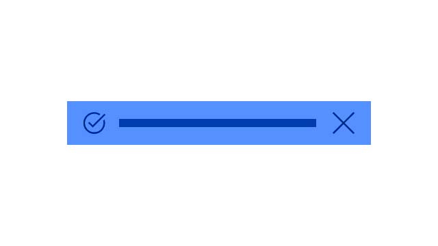
Message Bar
Alerts are nonmodal semantic dialogs that can be displayed at the top of the page or contextually within a task flow.
View guidelines
Badge
A badge is a visual label or indicator used to convey status or highlight content.
View guidelines
Breadcrumbs
A breadcrumb is a type of contextual navigation that shows a user’s position within the hierarchy of a site.
View guidelines

Button
Buttons are used to initiate actions within an application, website, or other digital experience.
View guidelines
Loading Indicator
A loading indicator is a visual animation used to convey processing or loading, but does not indicate how long the activity will take to complete.
View guidelines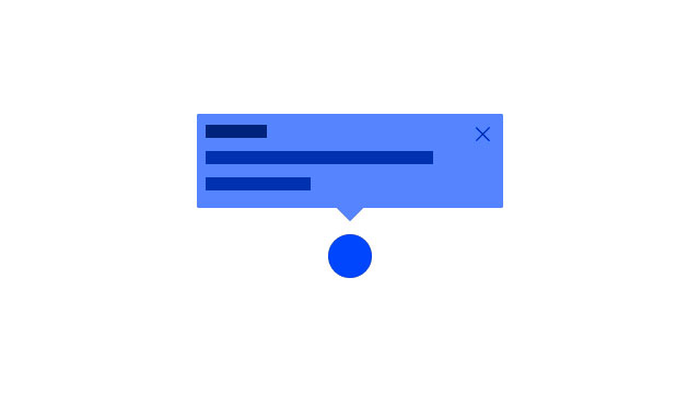
Notes
A nonmodal, passive dialog that keeps users informed without blocking access to the base page.
View guidelines