Foundations of Design Framework
A cohesive design system that shapes WGI’s digital ecosystem, prioritizing accessibility, inclusivity, and functionality.
Files Structure and dependencies
Each component uses a separate CSS file named after the component itself. The file structure is designed for easy maintenance and expansion of styles.
bootstrap.bundle.min.js – Required JS filr for animations, effects and correct transitions within Web-Browser window.
style.css – a service file that imports data from all CSS files.
root.css – the main file containing all variables used across other CSS files.
accordion.css – styles for the "Accordion" component.
addons.css – additional styles for root.css that are not defined through variables.
buttons.css – styles for all button elements.
colors.css – the color palette used in the style library.
fonts.css – imported fonts.
forms.css – styles for input fields, selects, and other form elements.
grid.css – base styles for layout and grid systems.
modals.css – styles for modal windows.
table.css – styles for table layouts.
tabs.css – styles for tabs and navigational elements.
typography.css – font settings, including typeface and styles.
tooltip.css – Tooltips and hovering effects.
utilities.css – utility classes for easier integration with the design library. It includes:
borders – border styles, including types, thicknesses, and colors.
dimensions – element sizes, including width, min-width, and max-width values.
display – controls how elements are displayed.
navigation – styles for the navigation panel.
opacity – transparency levels used in the design system.
position – rules for positioning elements along the X and Y axes.
shadow – shadow styles, including size, density, and intensity.
WGI's Digital Color System
This color system is crafted to support Dell’s extensive range of digital experiences, offering recommended use cases for consistency.
Accessibility First
Ensuring accessibility in color usage is crucial. Colors must meet contrast ratio standards and should not be the sole means of conveying meaning. Always verify compliance with accessibility guidelines below.
Color Usage Guidelines
This page provides overarching guidance on color application. For component-specific color recommendations, refer to the relevant component guidelines.
Core Color Palette
WGI’s signature blue tones establish brand identity while creating a cohesive user experience. Blue 600 serves as the primary UI color for key interactions. This palette also defines states such as hover, focus, selection, and activation. For further details, see component-specific guidance.
| Color Preview | Color Name | Use cases | Hex |
| Primary | Primary interaction | #0672CB |
|
| Secondary | Secondary interaction | #636363 |
|
| White | Background, surface, or offset content | #FFFFFF |
|
| Light | Background, surface, or offset content | #F5F6F7 |
|
| Dark | Background, surface, or offset content | #B6B6B6 |
|
| Black | Background, surface, or offset content | #000000 |
Secondary Palette
The design system’s secondary colors may evolve into a semantic palette, which will help users with wayfinding, identifying status, understanding actions, and locating help.
The list below includes universally recognized feedback colors and their meanings:
Blue: Informative
Yellow: Warning
Red: Error
Green: Success
Light Blue 100
#E9FAFF
Light Blue 200
#C4F0FF
Light Blue 300
#9CE1FF
Light Blue 400
#6AC9FF
Light Blue 500
#2EA4E6
Light Blue 600
#1C8DCE
Light Blue 700
#2380b4
Light Blue 800
#096BA6
Light Blue 900
#104E78
Blue 100
#D9F5FD
Blue 200
#94DCF7
Blue 300
#5CC1EE
Blue 400
#31A2E3
Blue 500
#1282D6
Blue 600
#0672CB
Blue 700
#0063B8
Blue 800
#00468B
Blue 900
#002A58
Green 100
#E9F5CE
Green 200
#C0DD78
Green 300
#9BC438
Green 400
#7AA809
Green 500
#5D8C00
Green 600
#4F7D00
Green 700
#436F00
Green 800
#2C5000
Green 900
#193100
Yellow 100
#FEEFCB
Yellow 200
#F5CD6F
Yellow 300
#E6AC28
Yellow 400
#CE8D00
Yellow 500
#B36F00
Yellow 600
#A36100
Yellow 700
#925400
Yellow 800
#6D3A00
Yellow 900
#442200
Red 100
#FFECEE
Red 200
#FFC3C9
Red 300
#FF99A1
Red 400
#FE6873
Red 500
#E4424D
Red 600
#D0353F
Red 700
#BB2A33
Red 800
#8C161F
Red 900
#590A0F
Neutral palette
These palettes feature colors which can be used for subtle backgrounds, high-contrasting elements like text and dividers, and elevation and depth.
Gray 100
#F5F6F7
Gray 200
#F0F0F0
Gray 300
#E1E1E1
Gray 400
#D2D2D2
Gray 500
#B6B6B6
Gray 600
#7E7E7E
Gray 700
#6E6E6E
Gray 800
#636363
Gray 900
#0E0E0E
Slate 100
#EBF1F6
Slate 200
#C5D4E3
Slate 300
#A4B8CD
Slate 400
#839DB4
Slate 500
#40586D
Slate 600
#293B4D
Slate 700
#1D2C3B
Slate 800
#141D28
Slate 900
#0A0E14
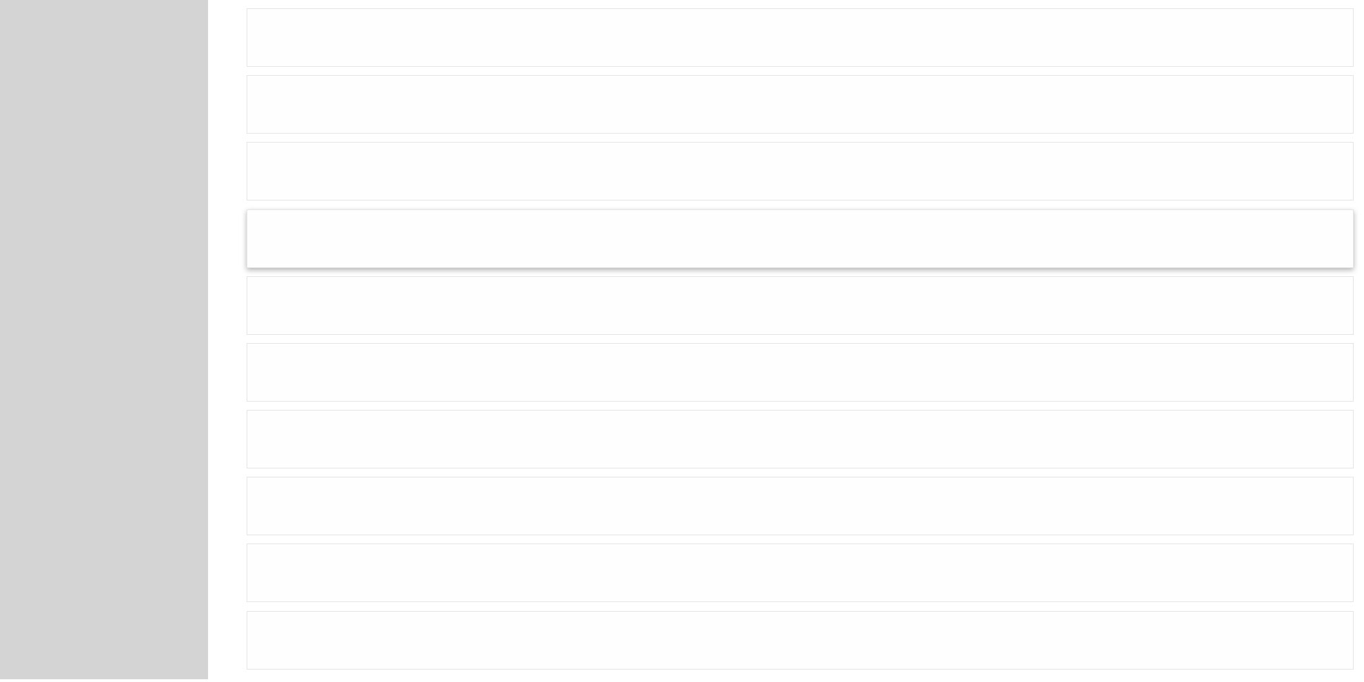
Elevation values
Different elevation levels create a three-dimensional effect by adding shadows and blur. As the elevation increases from 1 to 4, the shadows and blur expand along the X and Y axes, enhancing the sense of depth along the Z-axis. There are three shadow placement options: left, bottom, and right. See lighting guidelines for more details.
Shadow-noneShadow-smShadowShadow-lgElevation usage
Elevation is commonly used to create distance between objects, to set the direction of a light source, to make objects stand out against a background, and to give more dimension to elements.
Creating separation: Elevation helps establish distance between objects, define a light source direction, highlight elements against a background, and add dimension.
Differentiating elevation levels: When multiple elevation levels exist, raising the priority element’s elevation reduces confusion and clarifies surface distinctions.
Highlighting motion or interaction: Certain components, like accordion hover states, use elevation to indicate interaction.
Handling overlapping elements: Elevation is useful for interactive notifications or when backgrounds lack contrast. Adding depth helps prioritize key actions.
Establishing visual hierarchy: Higher elevation increases depth, making elements more prominent, while lower elevation keeps them visually subtle.
Baseline grid
The 4-pixel grid is the Design System standard. The recommended space between every element should be a multiple of 4 pixels, horizontally and vertically. Designing with a 4-pixel grid provides more flexibility and granularity for things like spacing text and icons.
Design system is using special horizontal & vertical spacing utilities (margin and padding) with predefined values:
m-0 / p-0– 0pxm-1 / p-1– 4pxm-2 / p-2– 8pxm-3 / p-3– 16pxm-4 / p-4– 24pxm-5 / p-5– 48px
mb-3 (16px) – recommended for spacing between text elements.
px-3 py-2 (16px x 8px) – commonly used for buttons and cards.
p-3 p-lg-5 (16px/48px) – used for content containers.
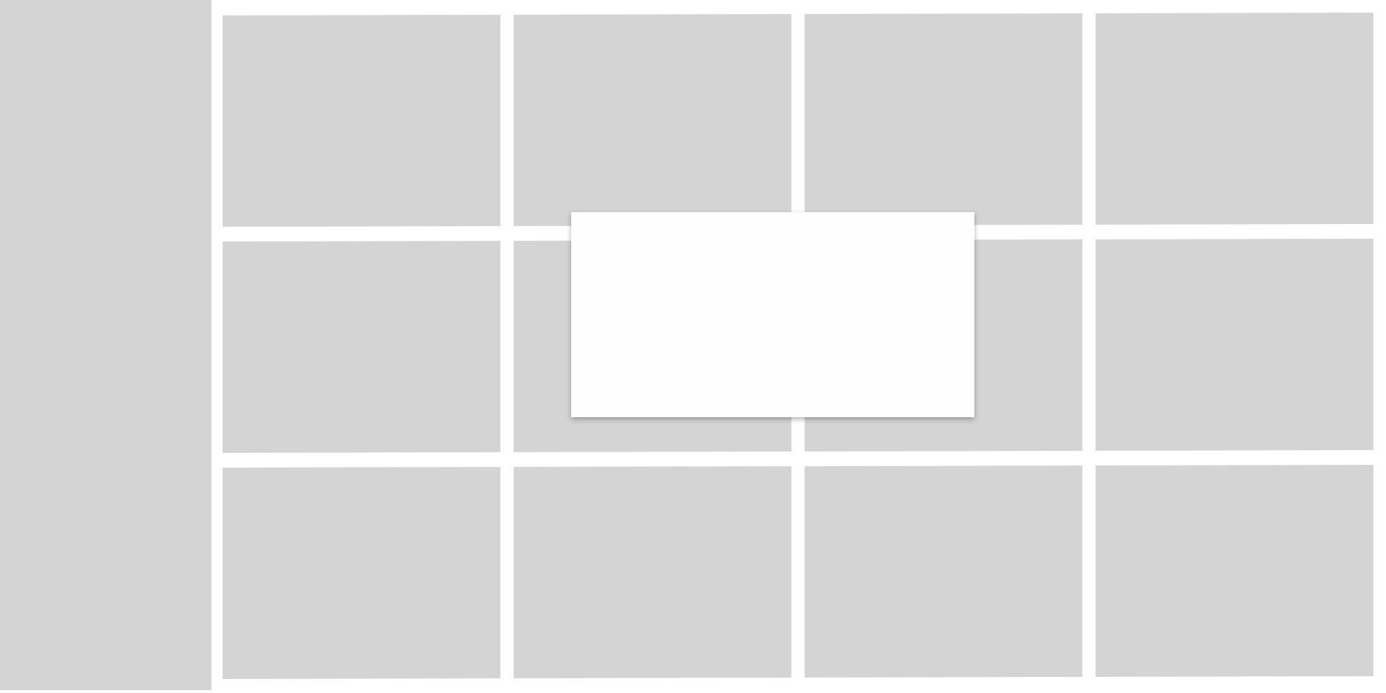
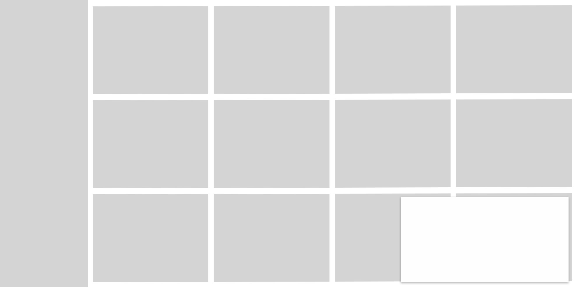
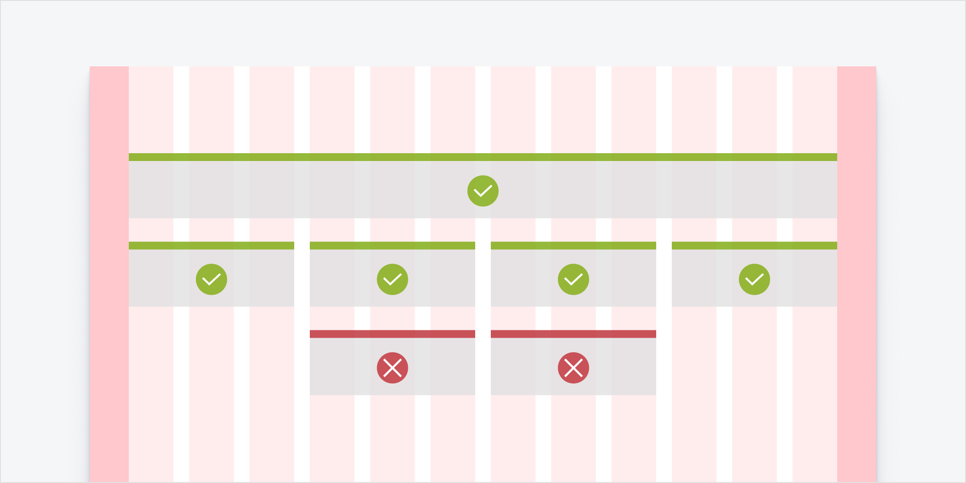
12-column grid
Most breakpoints are designed using the 12-column grid.
sm-Small: 576px;md-Medium: 768px;lg-Large: 992px;xl-Extra Large: 1200px;xxl-Extra-Extra-Large: 1400px;
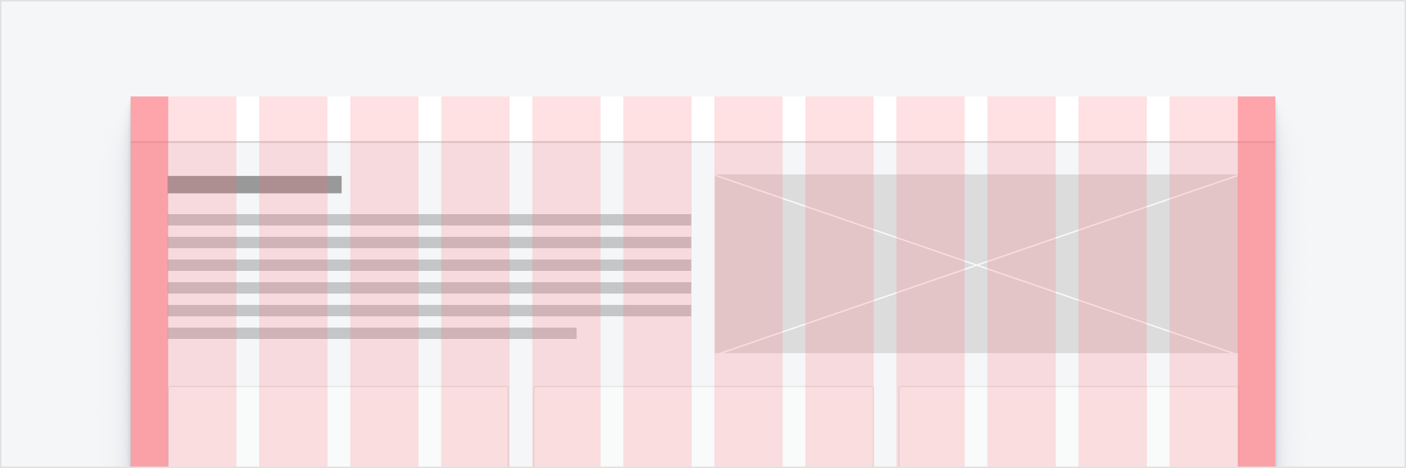
Standard 12-column grid with margins and placeholder content spaced across the columns and gutters of the grid.
Mix and match column widths by spanning multiple columns for a wide variety of layout options.
Make sure the content spans all of the columns in the layout (whether it is 2, 6, or 12 columns), rather than using columns as margins or padding. Following this methodology will keep layouts uniform and prevent unreliable responsive behavior.
Grid Examples
Grid Exampless based on usage of col class with -sm -md -lg -xl -xxl -1 to -12 modifiers.
Example:
<div class="row">
<div class="col-12 col-lg-6">
1211110293847566574839210111Grid Exampless based on usage of row row-cols class with -sm -md -lg -xl -xxl -1 to -12 modifiers. Maximum amount is 12. Columns width set as equal for every column.
Example:
<div class="row row-cols-2 row-cols-lg-2">
<div class="col"><div class="col">
colcolcolcolcolcolcolcolcolcolcolcolcolcolcolcolcolcolcolcolcolcolcolcolcolcolcolcolcolcolcolcolcolcolcolcolcolcolcolcolcolcolObject fit
Change the value of the object-fit property with responsive .object-fit-{value} classes. This property tells the content to fill the parent container in a variety of ways, such as preserving the aspect ratio or stretching to take up as much space as possible.
<img src="..." class="object-fit-contain border" alt="...">
<img src="..." class="object-fit-cover border" alt="...">
<img src="..." class="object-fit-fill border" alt="...">
<img src="..." class="object-fit-scale border" alt="...">
<img src="..." class="object-fit-none border" alt="...">


Typography
Typography is a deliberate system of letters, numbers, and characters. Good typography ensures legibility, clean aesthetics, and a well-defined information hierarchy.
The default styles apply to all breakpoints, except for displays and headers with breakpoints under 1024 pixels. That ramp is featured in the responsive font ramp section. Note that styles do not correspond to a specific HTML tag. An H1 tag can be assigned to any header style and size, as long as a logical hierarchy is maintained throughout the page and throughout your application.
| Style Class | Сases | Sample |
h1 |
Large heroes or banner titles | Lorem ipsum dolor sit amet, consectetur adipiscing elit. |
h2 |
Large banners or section titles a level below 1 | Lorem ipsum dolor sit amet, consectetur adipiscing elit. |
h3 |
Large banners or section titles a level below 2 | Lorem ipsum dolor sit amet, consectetur adipiscing elit. |
h4 |
Large banners or section titles a level below 3 | Lorem ipsum dolor sit amet, consectetur adipiscing elit. |
h5 |
Large banners or section titles a level below 4 | Lorem ipsum dolor sit amet, consectetur adipiscing elit. |
h6 |
Large banners or section titles a level below 5 | Lorem ipsum dolor sit amet, consectetur adipiscing elit. |
p |
Default body text size. Should be used for most body text. | Lorem ipsum dolor sit amet, consectetur adipiscing elit, sed do eiusmod tempor incididunt ut labore et dolore magna aliqua. Ut enim ad minim veniam, quis nostrud exercitation ullamco laboris nisi ut aliquip ex ea commodo consequat. Duis aute irure dolor in reprehenderit in voluptate velit esse cillum dolore eu fugiat nulla pariatur. Excepteur sint occaecat cupidatat non proident, sunt in culpa qui officia deserunt mollit anim id est laborum. |
Text modifiers
mark |
You can use the mark tag to highlight text. |
del |
|
s |
|
ins |
This line of text is meant to be treated as an addition to the document. |
u |
This line of text will render as underlined. |
small |
This line of text is meant to be treated as fine print. |
strong |
This line rendered as bold text. |
em |
This line rendered as italicized text. |
All classes apply to text:
| mark | Lorem ipsum dolor sit amet, consectetur adipiscing elit |
| small | Small Text |
| text-decoration-underline | Underlined Text |
| text-decoration-line-through | Line Through Text |
| text-lowercase | Lowercased text |
| text-uppercase | Uppercased text |
| text-capitalize | Capitalized text |
| fs-1 | Lorem ipsum dolor sit amet, consectetur adipiscing elit |
| fs-2 | Lorem ipsum dolor sit amet, consectetur adipiscing elit |
| fs-3 | Lorem ipsum dolor sit amet, consectetur adipiscing elit |
| fs-4 | Lorem ipsum dolor sit amet, consectetur adipiscing elit |
| fs-5 | Lorem ipsum dolor sit amet, consectetur adipiscing elit |
| fs-6 | Lorem ipsum dolor sit amet, consectetur adipiscing elit |
| fw-lighter | lighter text. |
| fw-light | Light text. |
| fw-normal | Normal text. |
| fw-semibold | Semi Bold text. |
| fw-bold | Bold text. |
| fw-bolder | Bolder weight text (relative to the parent element). |
| fst-italic | Italic text. |
| fst-normal | Text with normal font style. |
| font-monospace | Monospace font style. |
Line height
| lh-1 | Lorem ipsum dolor sit amet, consectetur adipiscing elit, sed do eiusmod tempor incididunt ut labore et dolore magna aliqua. Ut enim ad minim veniam, quis nostrud exercitation ullamco laboris nisi ut aliquip ex ea commodo consequat. Duis aute irure dolor in reprehenderit in voluptate velit esse cillum dolore eu fugiat nulla pariatur. Excepteur sint occaecat cupidatat non proident, sunt in culpa qui officia deserunt mollit anim id est laborum. |
| lh-sm | Lorem ipsum dolor sit amet, consectetur adipiscing elit, sed do eiusmod tempor incididunt ut labore et dolore magna aliqua. Ut enim ad minim veniam, quis nostrud exercitation ullamco laboris nisi ut aliquip ex ea commodo consequat. Duis aute irure dolor in reprehenderit in voluptate velit esse cillum dolore eu fugiat nulla pariatur. Excepteur sint occaecat cupidatat non proident, sunt in culpa qui officia deserunt mollit anim id est laborum. |
| lh-base | Lorem ipsum dolor sit amet, consectetur adipiscing elit, sed do eiusmod tempor incididunt ut labore et dolore magna aliqua. Ut enim ad minim veniam, quis nostrud exercitation ullamco laboris nisi ut aliquip ex ea commodo consequat. Duis aute irure dolor in reprehenderit in voluptate velit esse cillum dolore eu fugiat nulla pariatur. Excepteur sint occaecat cupidatat non proident, sunt in culpa qui officia deserunt mollit anim id est laborum. |
| lh-lg | Lorem ipsum dolor sit amet, consectetur adipiscing elit, sed do eiusmod tempor incididunt ut labore et dolore magna aliqua. Ut enim ad minim veniam, quis nostrud exercitation ullamco laboris nisi ut aliquip ex ea commodo consequat. Duis aute irure dolor in reprehenderit in voluptate velit esse cillum dolore eu fugiat nulla pariatur. Excepteur sint occaecat cupidatat non proident, sunt in culpa qui officia deserunt mollit anim id est laborum. |